RGB & CMYK, WTH?
Color is simple, right? Black is black, red is red and white is white. Well, not always.

By Felicia Watson
The idea that color is straightforward may be derived from learning the names and colors associated with each basic primary color before the age of five. This simplification doesn’t account for light sources impacting color, different printing methods or how color appears dissimilar in print, on websites and even from screen-to-screen.
Almost everyone has created a document on a computer, added a touch of color, printed it out and then discovered the color on the hard copy looks nothing like the color on-screen. Sometimes this can be baffling like a brain teaser without a logical answer but here is some insight.
Color modes are essential in the world of design, influencing how we see and interpret visuals. Two common color modes used in graphic design are CMYK and RGB, and understanding the RGB and CMYK difference between these modes is crucial for achieving the desired results in creative projects.

Shining a Light on RGB
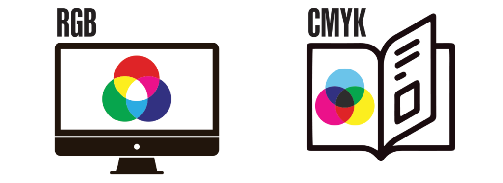
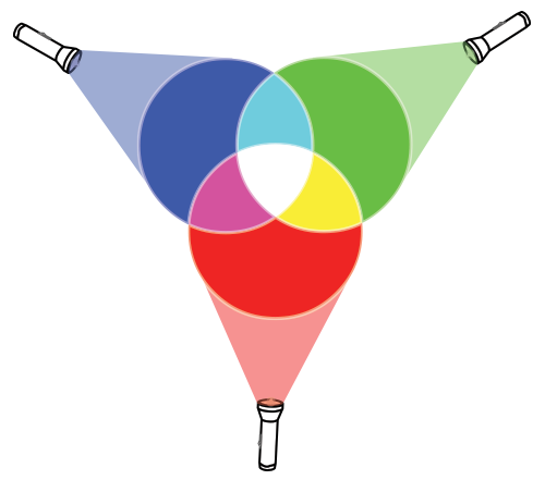
RGB is an acronym for red, green and blue and is a color model that represents colors as combinations of red, green and blue which uses light to produce a full spectrum of color. It is the most common color model used in electronic displays, such as computer monitors, mobiles phones and television screens.
In the RGB model, each color channel is represented by an 8-bit value, ranging from 0 to 255, where 0 indicates no intensity and 255 indicates full intensity. By varying the intensity of each channel, about 16 million different colors can be produced. Colors are additive in this model, meaning that combining different intensities of red, green and blue light can create new colors. For example, combining full intensity red, green and blue light creates white light, while combining no light in any channel creates black. This additive nature of RGB makes it ideal for digital displays, where different intensities of light can be produced by individual pixels to create a wide range of colors and shades.
By using varying intensities of red, green and blue light, RGB can reproduce a wide range of colors that closely match what the human eye can perceive. This makes RGB an essential tool for website creation, social media design, digital advertising, photography and video production, where accurate color reproduction is crucial. These examples have real world applications in the San Diego Tourism Marketing District’s (SDTMD) Tourism Matters campaign.

Printing in CMYK
Unlike digital design, CMYK – Cyan, Magenta, Yellow and Key (AKA black) – is the color model used in printing. CMYK is a subtractive color model, meaning that colors are created by subtracting varying amounts of light from white.
In CMYK, each of the four colors is applied in overlapping layers to create a wide spectrum of colors. For example, to create green, cyan and yellow are combined, while magenta and yellow create red. The black component, also known as the key color, is used to enhance contrast and depth in the printed image, as well as to create true black tones. Without black, a mix of the other three colors can result in a muddy or dark brown color.

Graphic designers use CMYK in various ways to create printed materials such as brand identies, annual reports, brochures and packaging. They must be aware of how colors will blend and interact when printed, as the final result may differ from what is seen on a computer screen. Designers often review color swatches and proofs to ensure that the RGB and CMYK difference will appear as intended in the final printed piece. Understanding the CMYK color model is essential for achieving accurate and vibrant colors in printed materials.
Digital Palettes with Hex Codes
HEX color, short for hexadecimal color, is a six-digit code comprised of letters and number used in graphic design to specify colors for a website or a digital asset. Each digit represents the intensity of red, green and blue light, allowing for a wide range of colors to be accurately reproduced. This format is particularly useful for designers because it provides a standardized way to communicate colors across different platforms and devices. By using HEX codes, designers can ensure that the colors they choose will display consistently across various screens, making it an essential tool for creating visually cohesive and appealing designs.
Pantone for Printing
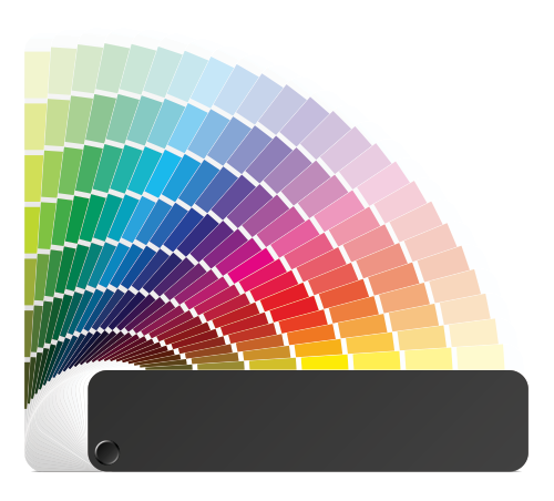
In print, Pantone (PMS) colors are a standardized color matching system used in graphic design and manufacturing industries. Each Pantone color is assigned a specific code, making it easy to communicate and reproduce exact colors across different materials and processes. Designers often use Pantone colors when creating branding materials, such as logos and packaging, to ensure that the colors remain consistent across various applications. Additionally, Pantone colors are commonly used in fashion design, product design and interior design to maintain color accuracy and consistency throughout the production process.
Understanding the complexities of color modes is crucial for graphic designers. These color modes allow informed designers to create visually appealing and consistent designs without surprises and bridge the gap between digital and print media seamlessly. The trick is to know the channel where the asset will be used and plan in advance.


