RGB & CMYK, WTH?
Color is simple, right? Black is black, red is red and white is white. Well, not always.
read moreColor is simple, right? Black is black, red is red and white is white. Well, not always.
read moreMost business leaders understand the value of having a memorable business name and logo, but many don’t realize the importance of a visual identity, what it entails, and why protecting it is paramount.Building a Creating social profiles that secure the business name across all major social networks should be done as well, even if there is…
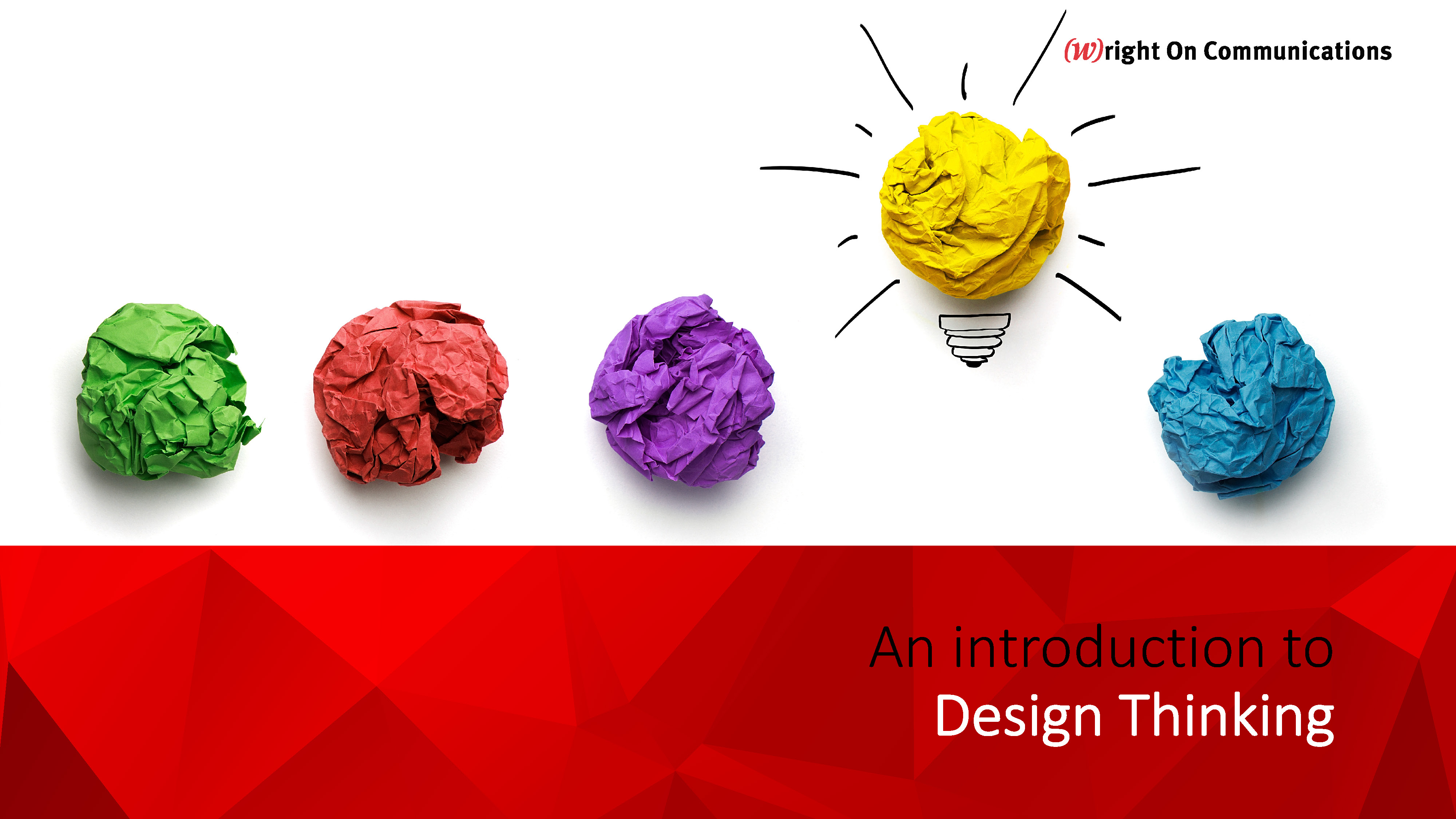
read more“Design thinking is a process for creative problem solving.” - Coe Leta Stafford, Managing Director IDEO U This presentation on Design Thinking was originally developed for an internal agency workshop by Graphic Designer, KeAsha Rogers. It spawned such great discussion among our team at (W)right On that we thought we'd share it on our blog…
read moreTake it from the team at (W)right On Communications, people often think about hiring a PR firm for the wrong reasons. But how can you gauge whether you're doing it for the right ones? If you recognize yourself in any of these five reasons for not hiring a PR firm, that's a sign you need…
read moreBy Kara DeMent, Communications Coordinator With more than two billion active social media users today, having a presence on social media is a must for brands that want to get noticed. With “best practices” and social media platforms evolving and ever-changing, it can be tough navigating the social media landscape to create effective campaigns. If…
read moreBy Keely Smith, Design and Multimedia Specialist Top 10 gifs that sum up the life of a graphic designer: When a friend offers you an opportunity to “build your portfolio” 3. When you inherit someone else’s art files 5. When you start noticing bad…
read more