Top 10 Gifs That Sum Up The Life of a Graphic Designer

By Keely Smith, Design and Multimedia Specialist

Top 10 gifs that sum up the life of a graphic designer:

  1. When a friend offers you an opportunity to “build your portfolio”

2


2. When you finally identify an obscure font

3


3. When you inherit someone else’s art files

4


4. When your software crashes and you didn’t save your files

6


5. When you start noticing bad design all around you

7


6. When your Photoshop layers are a mess but you’re too busy to care

8


7. When a client loves EVERYTHING you do

9


8. When you haven’t had coffee

10


9. When your colleague tells you “nice, but it needs more pop”

11


10. When people think being a graphic designer is “easy”

12


Graphic Designer extraordinaire Keely Smith has dealt with all these issues and more, but always with a smile and unfailingly with incredible results, because that’s just the way she rolls. The (W)right On team can’t imagine life without her, so try to keep her coffee mug topped up and restrict their asks for making something “pop” more. Check out Keely’s awesome web design and branding work on our Case Studies page.

How Infographics Work and Why Your Brand Needs to Use Them More

increase in visualsBy Chance Shay, Communications Strategist

In 2015 it’s impossible to browse a news site, scroll through your social media stream or learn about an innovative product without coming across an infographic and there’s good reason for that.

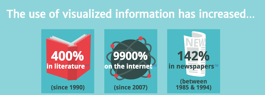
Humans are consuming more information than ever before. In fact, in 2008 Americans consumed about 1.3 trillion hours of information outside of work. This works out to an average of nearly 12 hours per person per day, which means most American’s are constantly consuming information other than when they sleep.

With so much information coming at a person each day, how does a brand communicate in a way that gives itself the best chance at having its information capture the attention of current and prospective customers?

Visually.

In addition to allowing information to be consumed easier, infographics lend themselves perfectly to the modern culture of social sharing. The cool designs, fun visuals and interesting kernels of data make infographics the perfect content to share with Twitter followers, muse about on YouTube channel,s up-vote on Reddit or even write a blog about (this blog about infographics being good for blogs = blogception).

But enough words, we’ll let the visuals do the talking. The good folks at NeoMam Studios put together an awesome interactive infographic webpage (we LOVE HTML5 too!) illustrating thirteen reasons why your brain craves infographics. Some of those images are below, but visit their webpage for the full list.

And remember the golden rule: if you can communicate your message visually, do it.

visually wired

information overload

visually persuasive

Check out our related posts below:

Solution-Based Web Tools For Every PR Pro

Your Competitive Advantage is Being Human


5 Signs Your Brand Needs a Refresh

branding refresh

branding refresh

By Keely Smith, Design & Multimedia Specialist

Branding plays an influential role in setting a business up for success. A brand is more than just a logo – it is a visual representation of a business’ values and creates an entire customer experience from the visual identity and website to social media presence. So is yours working for you? Below are 5 signs your brand is due for a refresh.

  1. Your brand looks outdated

Our world is certainly no stranger to change. With the adoption of new technologies, it is youtubeimportant to have a brand that moves a business forward and doesn’t hold it back. Having a “retro” identity may be intentional in some cases. However, if a brand is no longer effectively serving as a visual representation of your business and its vision and doesn’t communicate key messaging clearly, it’s time for an update.

A complete overhaul is not always the solution. Minor adjustments to existing elements, like a change in color palette or typefaces used, are very simple and effective ways to give your brand a facelift. The goal is to achieve an identity that looks timeless.

  1. Your brand is stunting growth

As a business grows, so should its brand. Let’s say a business changes its services offered – there has been a shift in target audience, or a new partnership has formed. A successful brand should reflect any modifications made. If the existing brand is no longer applicable to current growth and expansion, it’s time to go back and revisit the drawing board.

  1. Your brand doesn’t add value

Are you an industry leader? Do you have outstanding customer service? Are you serious about what you do and what your business has to offer? Great! Your brand should represent everything you take pride in as a business.

A well-thought-out, well-designed brand can do wonders for paving the way to success. A brand creates a “visual reputation” and has a major influence on public perception. If you want your business to be taken seriously, you need to seriously invest in the development of your brand. It will set you apart from competitors and is a proactive way to add value to everything you do.

  1. Your brand lacks consistency

Do you have five or more logos? Countless ways your brand is being used? Consistency is everything, and having too many brands or different logo elements displayed across different media platforms (web, social media, printed collateral, etc.) may hinder the message your business wishes to communicate. Less really is more when it comes to a visual identity. Excessive taglines, colors, gradients and drop shadows in graphic elements are a thing of the past. We have seen a shift in design trends from the overly flashy to the minimal and simplistic.

Although versatility is not a necessity, it provides an opportunity to establish a strong and consistent visual presence. You may have a visual element or icon associated with your brand, which could be used to create a background pattern for a website, for example. You can have a dynamic branding suite, yet maintain consistency and market your brand effectively.

  1. Your brand was your latest DIY project

DIY-foundation-repair-mistakeThere are countless platforms out there that allow anyone to create their own brand with the click of a button. Although this may be convenient and cost-effective, it runs the risk of projecting an unsuccessful or negative image. This is where investing in your brand pays off. It is important to work with a graphic designer when it comes to the development of your visual identity. Graphic design is an art form, and designers are constantly fine-tuning their skill. Designers specialize in visual communication and know how to deliver an intentional brand with a strong visual presence.

It all goes back to what you are trying to accomplish as a brand. Consistency is critical, and your branding should reflect that. Whether you’re a big corporation or a small startup, these tips will help you decide if a refresh is right for you.