Don’t Delete Your Google+ Profiles Just Yet: The Network Still Provides Benefits for Brands

Screen Shot 2014-05-28 at 3.00.34 PM

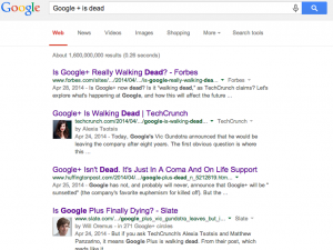
Everyone seems to have an opinion on the future of Google+.  A quick Google search of “Google+ is dead” nets several articles debating the future of the social network. The headlines read:

  • “Google+ Is Walking Dead.”
  • “Is Google+ Really Walking Dead?”
  • “Google+ Isn’t Dead. It’s Just In A Coma And On Life Support.”
  • “Google+ Isn’t Dead. Long Live Google +!”

In 2011, when I got an “invite” to join the new exclusive social network, I was excited about the possibilities. Would it replace Facebook as the social network du jour? Would Google finally launch a successful social media platform (RIP Google Buzz)? I was disappointed when, within a few short months, Google+ seemed to lose its luster.

Speculators have been hemming and hawing over Google+’s longevity since just after its launch, but those questions increased last month when Vic Gundotra, head of Google+ social efforts, announced that he was leaving the company. To add to the PR firestorm, Tech Crunch published an article citing a “source” that claims that “Google+ will no longer be considered a product, but a platform — essentially ending its competition with other social networks like Facebook and Twitter.” Google denied the claims.

(W)right On’s conclusion: Don’t delete your Google+ profiles yet.  While the future of the social network isn’t clear, it still provides a number of benefits for brands:

SEO: Google is a search engine, so it makes sense that Google+ provides significant SEO advantages. Google+ content itself – meaning content you post to your page – can rank in search results in instances where your website may not. Google+ also allows for near-instant indexing, whereas simply putting up new content and waiting it out usually takes a few days.

According to Forbes, “linking your Google+ page to your content via Google Authorship markup will cause the headshot and stats from your Google+ profile to show up in Google’s search results pages next to content you have written. This includes a your profile picture displaying within search results next to your content, which has been shown to draw user’s eyes and significantly improve click-through rates.”

Further, when someone follows you on Google+, it is much more likely that your content will appear higher in their search results. And when other Google+ users give a link multiple +1s, the pages shoot up in the search rankings.

No Pay for Play: Facebook has more active users than Google+. But with the latest change to its algorithm, Facebook has recently become “pay for play,” which means it’s difficult for posts to gain traction unless the page owner pays money to “boost” them. This means that “free” Facebook marketing may no longer a viable way for businesses to reach consumers.

[RELATED: Pay for Play: Will Facebook Get In Trouble?]

Quality Visits: According to a recent report from Shareaholic, Google+ actually has the second highest social media post-click engagement. YouTube took the #1 spot and Facebook is down at #5. So although Google+ drives fewer referrals compared to its competitors, it turns out the traffic it does drive is actually quite high on the quality scale. Google+ users spend more than three minutes diving into links shared by their circles, view 2.45 pages during each visit, and bounce only 50.63 percent of the time.

For these reasons alone, we recommend that brands include Google+ as one part of a comprehensive social media strategy. What are your thoughts on Google+? Is it dead, alive or maybe just sick? Join the debate in the comments.

Five Tips for Creating a Visual Brand

five-tips-image
 
Visuals only hold the value that we give them. With no context, a shape is just a shape. Though it may serve many purposes in many forms, from complex geometry and math to the rich history of a 200-year-old brand, a shape on its own won’t tell your audience a story.
 
Suppose we took a shape and placed it with another to give it context:
 
Black-x-o
 
In this instance, we can note that the shapes aren’t the same, but they appear to have similar weight and value. What happens if we distinguish them further?
 color-x-o
 
Now we can assume more about these two shapes. They’re different colors and different shapes. They must be opposites.
 
It happens often. You’ll view an object that you haven’t encountered and make inferences about its use based on your personal experiences. The same happens with brand visuals. How can we influence our audience to make positive assumptions about us? How do we make sure that they view us in a good light, even if they’ve never interacted with our product?
 
1. Intentional Design
 
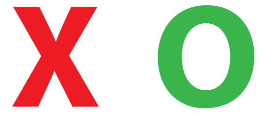
Like in the above example, we naturally make assumptions based on related experiences. It’s likely that we viewed the red “X” as a negative symbol, and the green “O” as a positive symbol. These exist for many other symbols, characters and even colors. It’s important that we bear in mind the suppositions that can be made about a brand.
 
Fortunately, designers have the edge. They have their own experiences in what has worked to connect with target audiences and what hasn’t, and can bring these experiences back to you. A designer’s real expertise is their ability to put themselves in the perspective of someone who has had baseline exposure to your products. In combination with the knowledge of their target market, designers have the opportunity to shape consumers’ opinions and future expectations of your brand.
 
2. Coherency
 
Visuals should obviously fit with company messaging: Composition is appropriate to the designer’s medium, color palettes appropriate to the unique target market and everything from front to back works toward the overarching goal. But as they say, “the devil is in the detail.”
 
What’s not so obvious is that a brand should be descriptive of its origins and convey your goals in the market. A brand should put a face to a product, service or organization. And when potential consumers look at the competition, they should be able to clearly see the difference in the experience your product can offer.
 
3. Design for People
 
One of the things that is not stressed enough is that people are going to be the ones viewing any branding you execute. When determining what “personality” a brand conveys, consumers often hope for something “tech-y” or “friendly” or “fun – those descriptors are a few of many, of course.” A successful brand will find ways to tie these themes back to the people in its market. It’s important to keep reminding yourself that your brand isn’t trying to appeal to your competitors.
 
As a designer, a good measure of success is the ability to provoke emotion, whether a simple positive/negative reaction like, “this is nice,” or nostalgic feelings, like remembering the color shirt your first date wore to the movies. Emotion is a good indication of success because it lets us know if and how people are making a connection to a brand. Keeping a brand too “market-centric” prevents doing so on a larger scale.
 
4. Flexibility
 
A flexible brand keeps things from becoming stale and brings a human quality to any and all of its messaging and collateral. Brand flexibility can open the door to many opportunities, and great brands can translate across multiple platforms simply and effectively. A successful brand will have a clear, recognizable and consistent message throughout.
 
It’s often difficult to tell what’s coming around the corner. Sometimes a series of events – planned or otherwise — could lead you to huge growth or opportunity to reach a larger audience. Going through the effort of a rebrand could be costly or untimely. When developing a brand, it’s hard to be conscious of the unknown, but leaving your visuals flexible can set you up early for success.
 
5.Continuity
 
Like a great brand translates across platforms, a great brand can also translate across multiple generations. A brand can go through multiple rebrands and changes in messaging but always remember the brand is about the product or service. Keeping this in mind will help develop a consistent brand.
 
Continuity is the bridge between the visual and non-visual elements of your brand. This includes everything from the product, messaging, history, imagery and color scheme. Though these elements may change, the bridge that brings them together should not.
 
Need some examples of great visual brands? Visit our page to get our take on effectively approaching and building a brand. Or, comment below and tell us if you have any tips.